The Handel Font Family is what they used in the original Knight Rider credits and is very readable. You might want to consider using that for your badge fonts. Other fonts used in KR were MicroGamma, Eurostile Extended Bold, and Alt Gothic Bold (season 3/4 dash)
Here is Handel:
 http://www.fontfinder.ws/14271/Handel-Gothic.html
" onclick="window.open(this.href);return false;
Search around the net -- you can find it for free.
I also agree with the others points regarding your intial design -- When I made my badges for SDCC, I made them around 5in x 3.5in but I also designed them to be worn with a lanyard and these badges worked out great for me.
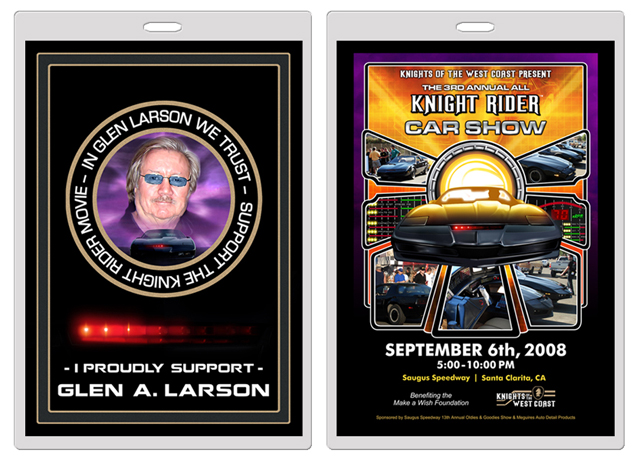
Here's an example of my double sided badge - note that I keep my text away from the edges so it doesn't get trimmed off.
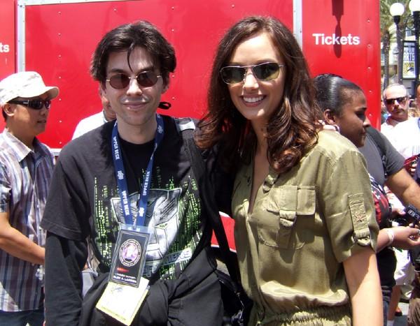
Here is a photo Neil took of me wearing my badge with Deanna Russo at SDCC
You would most likely want a single image on both sides so the info is always visable. Badges like mine flip around constantly.
Whether you're doing a badge like mine or a smaller one that is pinned to your shirt, keep your text bold and clearly visable. Don't use colors that conflict (like yellow on white background or colors that are too close in tone/hue to one another like bright red/medium red) and you should do fine. I know you want to show the two KITT cars but try not to be too redundant with it - find a middle ground. Keep in mind that no matter what, it's your text information that people will search for first and then your imagery.
Hope that helps out and good luck.
=VK=