The majority will factor into the direction of the artistic decision process.
=VK=
Moderators: neps, Matthew, Michael Pajaro


JJSoCrazy wrote:I tried to post the most accurate dash that I would like to see but here goes:
- The whole idea of the iPhone (which I have and LOVE) is a good idea. It makes the use of a touchscreen which all advanced objects such as phones, computers, and many other technological features also my Nav in my car, touch screen is a MUST. However not the whole dash, but some should be touch such as the screen or whatever they use in order to access the police database, DMV records, etc..
- The buttons could be used for some of the features again but in a more advanced way such as the Eject roof and such.
- I do wish to have the original dash somewhat, I mean all those L.E.D.'s aren't necessary but some are sufficient.
- I like the idea of a H.U.D. and a design on the dash that is similar to a unique dash with in itself, not like the NBC KR08 dash, that wasn't that spectacular.
- The main monitor should be towards the lower center of the dash that will show everything that is visibly needed such as the rear of the car when in pursuit or when looking up a bad guy's profile. There should be a monitor of some sort but I am sure that Glen and TWC will come up with some unique ideas.
Basically Knight Ride in today's day and age needs an advanced look and can't resemble the original dash 100%, we need something that will blow everyone away. Too many lights are just annoying in today's day and age, touch screen and some unique L.E.D.'s should do it!


victor kros wrote:I think this is one of those subjects that needs to be explored because I know there are people who prefer the Scheffe Dash style graphics and others who prefer a more streamlined format.
The majority will factor into the direction of the artistic decision process.
=VK=
This is exactly the look and feel I wanted my own KITT to be like (if I ever made one). IMO, when the dash is off, everything should be black - no markings or anything. I'd like the dash to be like a T-shape - one long black strip across the top and another perpendicular coming down to the lower console in one smooth curved strip.Matthew wrote:For quiet some time, I’ve felt that the perfect way to update KITT’s dashboard would be to simply convert the LED readouts to touch screen panels. This keeps all of the gauges and readouts visible at all times, like they should be for a car that is essentially a prototype aircraft inside the body of a car, but also technologically updates the look significantly.
Imagine, for example, the third season dashboard as it was originally presented, with whiteout LED’s. When the engine is turned off, it would be blacked out entirely. Turn the ignition key one notch, and the whiteout look powers up. Turn the key to the second notch, and the readouts begin to come to life in the traditional yellow, green and red colour scheme. Turn the key to the third notch, and the engine comes to life along with the speedometer, tachometer, and vehicular gauges, such as the odometer.
I think this would be the perfect look for the new movie, as it gives off a visual link to KITT’s slick black shell, and updates the technology without alienating what captured our hearts in the first place.
Matt


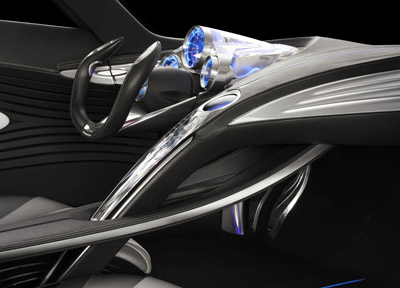
Very nice. Keep the original layout and turn the color theme to red, maybe.Kaine wrote:i'd like to see something roughly in this style:
also the dash should be roughly shaped like the one in the original KITT...


You know guys sometimes simple is a good thing, i like the iphone type display on KITT. Why have to have a ton of buttons around when you can just page through them all on one screen? Only thing i think it could possibly use are pod buttons close to the wheel like on the original for fast action. Say if with the pods you could program them with the main center console interface. Now if you go too far with 10 lcd screens & crazy colors all over the place or too retro with a array of big block buttons it would look ridiculous. I think for the times now it looks fine & could just use minor tweaks. Its not the year 2099 nor is it 1982.victor kros wrote: I think what NBCU did with their interface was too simple and too isolated to just that one center panel of the Mustang. We know that it had digital gauges as well but rarely saw them.
- I believe the poll numbers speak for themselves and last time I checked the NBC dash isn't fairing too well. Buttons are a necessity because LCD screens, touch screens and the like take time to warm up and in the heat of a moment where split decisions are necessary you don't have time to cycle through drop down menus to find a function. For this reason, physical buttons at the ready will still remain superior.GarthKnight08 wrote:You know guys sometimes simple is a good thing, i like the iphone type display on KITT. Why have to have a ton of buttons around when you can just page through them all on one screen? Only thing i think it could possibly use are pod buttons close to the wheel like on the original for fast action. Say if with the pods you could program them with the main center console interface. Now if you go too far with 10 lcd screens & crazy colors all over the place or too retro with a array of big block buttons it would look ridiculous. I think for the times now it looks fine & could just use minor tweaks. Its not the year 2099 nor is it 1982.victor kros wrote: I think what NBCU did with their interface was too simple and too isolated to just that one center panel of the Mustang. We know that it had digital gauges as well but rarely saw them.
=GK08=
