Knight Rider Font (was part of Kittrules?)

Archive for discussions from 2009. Please post new discussions in the appropriate forum.

Moderators: neps, Matthew, Michael Pajaro

Locked
User avatar
Victor Kros
FLAG Operative
Posts: 1600
Joined: Sun Sep 30, 2007 7:10 am
antispam: No
What year did the original Knight Rider start: 1982
Location: Knight Manor

Knight Rider Font (was part of Kittrules?)

Post by Victor Kros » Mon Jun 16, 2008 6:19 pm

Mr. Guy wrote:Hi guys - I just cruised by the Kittrules.com site and saw a new pic.

Apparently it's a "K".

Can't say this really helps out my ol' guessing game.

I'm curious how his fits in with VK's thoughts - BUT - please don't tell me your guess - I'm enjoying the drama!
- I won't say what I suspect it is and rain on anyone's parade. I do however find it interesting that this is allegedly an official product, yet from the style of the "K" in the teaser graphic it's not using the real Knight Rider typeface logo, it's using the fan made TTF font instead. I can tell by the rounded off serifs.

I should know this because I tediously recreated the original logo in painstaking detail as part of the project I'm working on.

Image

Image

As Neil pointed out by the quote below:
Also a note: this is something official as just a hint.
Why would an officially released product be using such a common fan made font?

The plot thickens.

Let speculation and excitement continue...

=VK=
:dash:

User avatar
neps
Site Administrator
Posts: 3261
Joined: Mon Mar 18, 2002 1:01 am
What year did the original Knight Rider start: 0
Location: nyc, usa
Contact:

Re: Kittrules?

Post by neps » Mon Jun 16, 2008 9:24 pm

Actually, the Knight Rider typeface is very closely based off the "Rubens" type face - which was originally cut in Wood around 1890.

This isn't the exact weight (i'm on vacation and without my original links in front of me) but you can see how closely this resembles the title font:
http://www.woodentypefonts.com/Pages/rubens.html

I'm not saying thats what kittrules.com is using, but that is the history as I know it. Besides, it took me a long time to track down that font a number of years ago - its quite possible that knowledge (the official name of the font by those who should know) is lost to time as well.

User avatar
Victor Kros
FLAG Operative
Posts: 1600
Joined: Sun Sep 30, 2007 7:10 am
antispam: No
What year did the original Knight Rider start: 1982
Location: Knight Manor

Re: Kittrules?

Post by Victor Kros » Tue Jun 17, 2008 7:09 am

Another reason you can't find an exact match is because the font was modified with custom "tails on the "N, R, H, A, and M. The "M" was especially modified to feel very gothic as opposed to the other letters. You can see the dagger like point in it.

Image

Image

Image

Glen explained to me one night that he wanted the title of Knight Rider to have a mideval-texas feel to it.

I believe the texan look was supposed to resemble the title for "Dallas"

Image

Image

You can see some resemblance in the D and the S. Just make some angles on the ends and add seriffs.

Your guess is as good as mine what Universal actually calls it. I think at this point, they don't even have it anymore. I seem to recall (if I'm not mistaken) there were classic KR fonts used on the set of the KR backdoor pilot on buckets and chairs which were using the same fan based (founded seriff) KR fonts everyone else uses these days.

Yet another reason why I just chose to make the letters myself.

=VK=
:dash:

User avatar
Scott Kirkessner
FLAG Recruit
Posts: 445
Joined: Mon Mar 18, 2002 1:01 am
What year did the original Knight Rider start: 0
Location: Utah
Contact:

Re: Kittrules?

Post by Scott Kirkessner » Tue Jun 17, 2008 9:12 pm

That K actually looks close to what was used for Columbia House's Knight Rider release.

davidodesign
Stranger
Posts: 1
Joined: Wed Jun 18, 2008 10:02 pm

Re: Kittrules?

Post by davidodesign » Wed Jun 18, 2008 10:13 pm

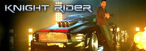
Hey there. I am new to your discussion board. Sue asked me about the typeface that was used for the Knight Rider television show titling, and I wanted to share the information that I offered to her about this.

The font you are asking about has an interesting history. The roots of the "Knight Rider" typeface go back to England in the 1890s. Many variations of this type were created, the most well-known being those created by a type foundry called James Marr and Company; other famous designs was created by William Hamilton Page, a well-known wood type designer in the 19th century. It seems that this type style was the "in thing" back in the 1900s.

Many modern-day variations of this font have been created since then. All of these font designs share the common characteristics you are looking for, each with it's own variation on the theme. A partial list includes:

William Page 500, by William Hamilton Page, revived by Jordan Davies
William Page 506, by William Hamilton Page, revived by Jordan Davies
Excelsis, by Dan X. Solo (2004)
Farquharson, by David Vereschagin (1991)
Mansion, by David Occhino (1995)
Ravenscroft, by Justin Cunningham (2001)
Rubens, by Jordan Davies (2005)
Ruben, by Anonymous (1996)

It is this last font, "Ruben" by Anonymous, that is the closest to the Knight Rider titling. I have tried to find out who created it, but with no luck. The creation date for the Ruben font is 1996, ten years after the Knight Rider television series ended. Also, in 1982 when the series began, computer fonts were not available. Back then typesetting for television and film was done differently, using analog procedures. So "Ruben" could not have been the font used.

My "Mansion" font is a variant of the Knight Rider type, but Mansion condensed: it's the same letter style but stretched out vertically. Some of you have already visited my website to take a look at it. Thank you for checking out my stuff. (http://davidocchino.com/portfolio/typography)

I hope this information is helpful. I am fascinated with the evolution of type, and your question was fun to answer. If you have other questions, or need any other font advice in the future, please let me know.

David Occhino
David Occhino Design
Mansion font/Knight Rider style font

User avatar
neps
Site Administrator
Posts: 3261
Joined: Mon Mar 18, 2002 1:01 am
What year did the original Knight Rider start: 0
Location: nyc, usa
Contact:

Re: Knight Rider Font (was part of Kittrules?)

Post by neps » Wed Jun 18, 2008 10:38 pm

David!

Thanks for stopping by and helping to shed some light on this mystery. Did you see the link above that claims the following - it seemed to be the furthest back I could find on it's history.
Rubens Regular is based on an original wood type, a 6 line specimen,
original manufacturer unknown. The design is similar to an English specimen,
though less condensed, from the typefounding company of James Marr & Co. circa 1890.
I also have this type book (http://www.amazon.com/Victorian-Display ... 0486999564) from 1994 that has a Rubens font face in it. You can see by the attached png that almost every letter is very close to the one used in the titles - except for the M, and the overall weight isn't as thick. Also the info on the font file I have says it was digitized by Dan X Solo - which matches one of your names.

Neil
Attachments
rubens sample
rubens sample
Picture 1.png (58.14 KiB) Viewed 27196 times

User avatar
Victor Kros
FLAG Operative
Posts: 1600
Joined: Sun Sep 30, 2007 7:10 am
antispam: No
What year did the original Knight Rider start: 1982
Location: Knight Manor

Re: Knight Rider Font (was part of Kittrules?)

Post by Victor Kros » Thu Jun 19, 2008 11:05 am

Image

Looks close to the font for The Haunted Mansion too (the attraction, not the movie)

Especially the lowercase which is almost dead on.

Sorry, I couldn't find the image any smaller.

=VK=
:dash:

User avatar
Sue
KRO Field Correspondent
Posts: 1450
Joined: Fri Apr 11, 2008 6:20 pm
What year did the original Knight Rider start: 0
Location: From NJ now in LA
Contact:

Re: Knight Rider Font (was part of Kittrules?)

Post by Sue » Thu Jun 19, 2008 4:56 pm

David thanks so much for investigating that for us! That was very kind of you!
Hello, I am Sue’s Hybrid Automated Droid One-thousand. But you may call me SHADO.

User avatar
Sue
KRO Field Correspondent
Posts: 1450
Joined: Fri Apr 11, 2008 6:20 pm
What year did the original Knight Rider start: 0
Location: From NJ now in LA
Contact:

Re: Knight Rider Font (was part of Kittrules?)

Post by Sue » Wed Jul 02, 2008 11:49 am

I just found this KR font with a tip from MJ Knight. And it’s free!
http://www.fortunecity.com/lavender/poi ... /id114.htm
Scroll down and you’ll see it. Oh, and look! Right below it you can discover a place to chat about TKR. :D
Well, if it was still 1998 you could. :D
Hello, I am Sue’s Hybrid Automated Droid One-thousand. But you may call me SHADO.

1982
Rookie
Posts: 91
Joined: Mon Dec 17, 2007 11:42 pm

Re: Knight Rider Font (was part of Kittrules?)

Post by 1982 » Thu Jul 03, 2008 4:08 am

Here is a link for a free download of the Ruben font.

http://www.grimghosts.com/down/fonts/fonts.html

Another font that is close to the KR font is Macbeth. But like all the others listed, there are one or more characters that do not match completely. In the link Sue gave the "A" doesn't match.

It would appear that the KR font is a combination of the fonts listed above.

User avatar
Sue
KRO Field Correspondent
Posts: 1450
Joined: Fri Apr 11, 2008 6:20 pm
What year did the original Knight Rider start: 0
Location: From NJ now in LA
Contact:

Re: Knight Rider Font (was part of Kittrules?)

Post by Sue » Thu Jul 03, 2008 11:17 am

Thanks 1982! David was right that ruben font is a close match, it's my favorite so far.
Hello, I am Sue’s Hybrid Automated Droid One-thousand. But you may call me SHADO.

User avatar
CJaguar442
FLAG Assistant
Posts: 550
Joined: Tue Jul 25, 2006 3:23 pm
What year did the original Knight Rider start: 0
Location: Boston, Massachusetts
Contact:

Re: Knight Rider Font (was part of Kittrules?)

Post by CJaguar442 » Fri May 08, 2009 4:28 pm

Image

What font style is this?
Re-elect Mayor Goldie wilson, Progress is his middle name!
Save the Clocktower!
Go Boston Red Sox! Go Boston Bruins! Go Boston Celtics!
Go the distance and he will come!

User avatar
Sue
KRO Field Correspondent
Posts: 1450
Joined: Fri Apr 11, 2008 6:20 pm
What year did the original Knight Rider start: 0
Location: From NJ now in LA
Contact:

Re: I found the Knight Rider font...

Post by Sue » Fri May 08, 2009 7:34 pm

Not sure but here's a cheap imitation.
http://www.fontspace.com/digital-graphics-labs/bitwise
Hello, I am Sue’s Hybrid Automated Droid One-thousand. But you may call me SHADO.

Locked