Knight Rider Fonts
Moderators: neps, Matthew, Michael Pajaro
-
rulloa81

- Operative
- Posts: 231
- Joined: Fri Jun 17, 2005 5:26 pm
- What year did the original Knight Rider start: 0
- Location: Los Angeles, CA
Knight Rider Fonts
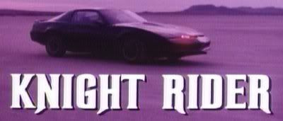
I was wondering why they use a different font for the cover of the KR DVD's instead of the font that appears during the intro? Don't get me wrong I do like the newer fonts but I was just wondering why they changed it.
-
msKEN

- FLAG Assistant
- Posts: 781
- Joined: Tue Mar 19, 2002 1:01 am
- What year did the original Knight Rider start: 0
- Location: Cincinnati, OH
- Contact:
Anyone know the name of the new font? or know of a font that is simular to the one used on the dvd?
The Knight Rider Fan Game Project:
http://www.theknightrider.com" onclick="window.open(this.href);return false;
http://www.theknightrider.com" onclick="window.open(this.href);return false;
-
neps

- Site Administrator
- Posts: 3261
- Joined: Mon Mar 18, 2002 1:01 am
- What year did the original Knight Rider start: 0
- Location: nyc, usa
- Contact:
The font or a variation of it is called "Bullet"
You can find it here: http://houseind.com/index.php?page=showfont&id=8
You can find it here: http://houseind.com/index.php?page=showfont&id=8
-
msKEN
- FLAG Assistant
- Posts: 781
- Joined: Tue Mar 19, 2002 1:01 am
- What year did the original Knight Rider start: 0
- Location: Cincinnati, OH
- Contact:
Thanks Neil!
The Knight Rider Fan Game Project:
http://www.theknightrider.com" onclick="window.open(this.href);return false;
http://www.theknightrider.com" onclick="window.open(this.href);return false;
-
neps
- Site Administrator
- Posts: 3261
- Joined: Mon Mar 18, 2002 1:01 am
- What year did the original Knight Rider start: 0
- Location: nyc, usa
- Contact:
It's an old wood type font called "Rubens". It was made in 1890.  You can find a free hack job version of it on some Knight Rider sites, but the spacing and angles are horribly off, plus it doesn't have the lowercase set.
This is a version of it that is a little condensed, and the G is off. http://www.woodentypefonts.com/Pages/rubens.html
This is a version of it that is a little condensed, and the G is off. http://www.woodentypefonts.com/Pages/rubens.html